Cover Art

I’m not sure whether I can choose between the greater of two excitements: getting news that your writing is being published, or being shown the cover of the book for the first time.
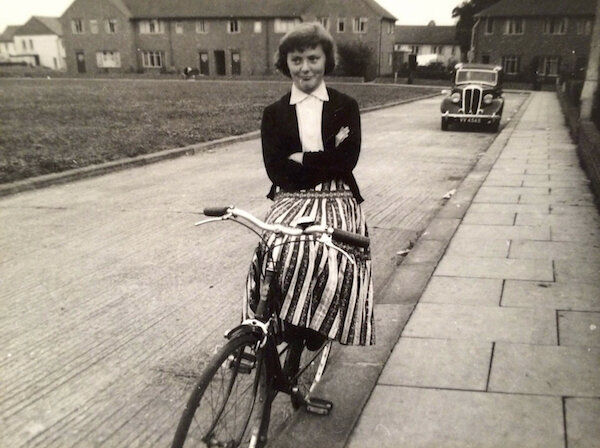
Of course, the latter can also be a rather fraught experience for writers, which is something you only learn when you get published and start talking candidly to other novelists. For, as many times as I’ve heard a writer say they love their book’s cover, I’ve also heard them say they would have preferred some other cover, or the design wasn’t really their choice, or they had no consultation over the “packaging” whatsoever. I feel I’ve been lucky with my covers. The award-winning book designer, Allison Colpoys, designed the Italians at Cleat’s Corner Store. When I first saw the design, although it was a little more fey and girlie than I’d expected, the drawing had a rather special pull for me. The reason was a photo from the 1950’s that I keep on my pin-board. It’s of my Mum, Pat, with her precious Malvern Star bicycle. She would have been about 17 in the shot and she’s wearing a smile that is a strange mix of the provocative and the proud.
Before she died, I remember Mum telling me about this bike, how it had been “racing green” and how she’d saved and saved for it so she didn’t have to ride her dad’s bike (with its wooden blocks attached to one side of the pedals because the seat was jammed at his height). Anyone who’s read my book will know this photograph and its story directly inspired Connie and her own bicycle.
In addition, during the writing process, whenever the novel was getting me down, or I was questioning what the hell I was doing locking myself away all hours of the day and night to write a book no one would probably ever read, I’d look at this photo of my Mum. Writing it for her, because she would have thought it a dream worthy of pursuing, seemed a good enough reason.
When Allison first sent me the designs for the cover, she hadn’t seen the photo of my mum and had no idea what it meant to me. It seemed so uncanny, I had to send her a PDF showing her how closely she’d channelled what, to me, had been the spirit of the book.
I was glad when I saw the cover of Shibboleth and Other Stories to see it so closely recalled the original installation that had affected me so much.
The design, by another award-winning book designer, Susan Miller, seems to capture the impact, the shock of the original artwork, while also seeming to suggest the moment of impact, the punch, as it were, which short stories have the ability to pack.
Sometimes, this happens slowly with a gradual build, and other times it comes to you suddenly, with the shock of a sideswipe. Either way, I guess that’s what short stories do: they focus on the point of impact or change or fracture. I can’t wait to read the rest of the collection.

